


iOS 15 Compatibility: There is a bug in Shortcuts on iOS 15 that prevents syncing of your shortcut library from the Shortcuts to MFC Deck. Until this bug is resolved by Apple (FB9585913), MFC Deck will be unavailable to download from the App Store.
API
MFC Deck comes with over 30 custom actions to use in your own shortcuts. Learn also how to create rich cards with icons, text, backgrounds, and more by understanding the Card Result Format.
Custom Actions
MFC Deck exposes a number of custom actions to control MFC Deck from your own shortcuts.
- Add Image
- Background Automations
- Background Automations Details
- Create Card
- Create Deck
- Create Tag
- Delete Card
- Delete Decks
- Delete Images
- Delete Tags
- Display Card Result
- Get Card
- Get Current Deck
- Get Deck
- Get Decks
- Get Default Deck
- Get Image
- Get Images
- Get MFC Deck Details
- Get Tag
- Get Tags
- Get Triggers
- Open Deck
- Refresh Cards
- Reload Widgets
- Run Card
- Set Current Deck
- Set Default Deck
- Start Monitoring
- Stop Monitoring
- Update Card Result
- Update Shortcuts
- Update Trigger Result
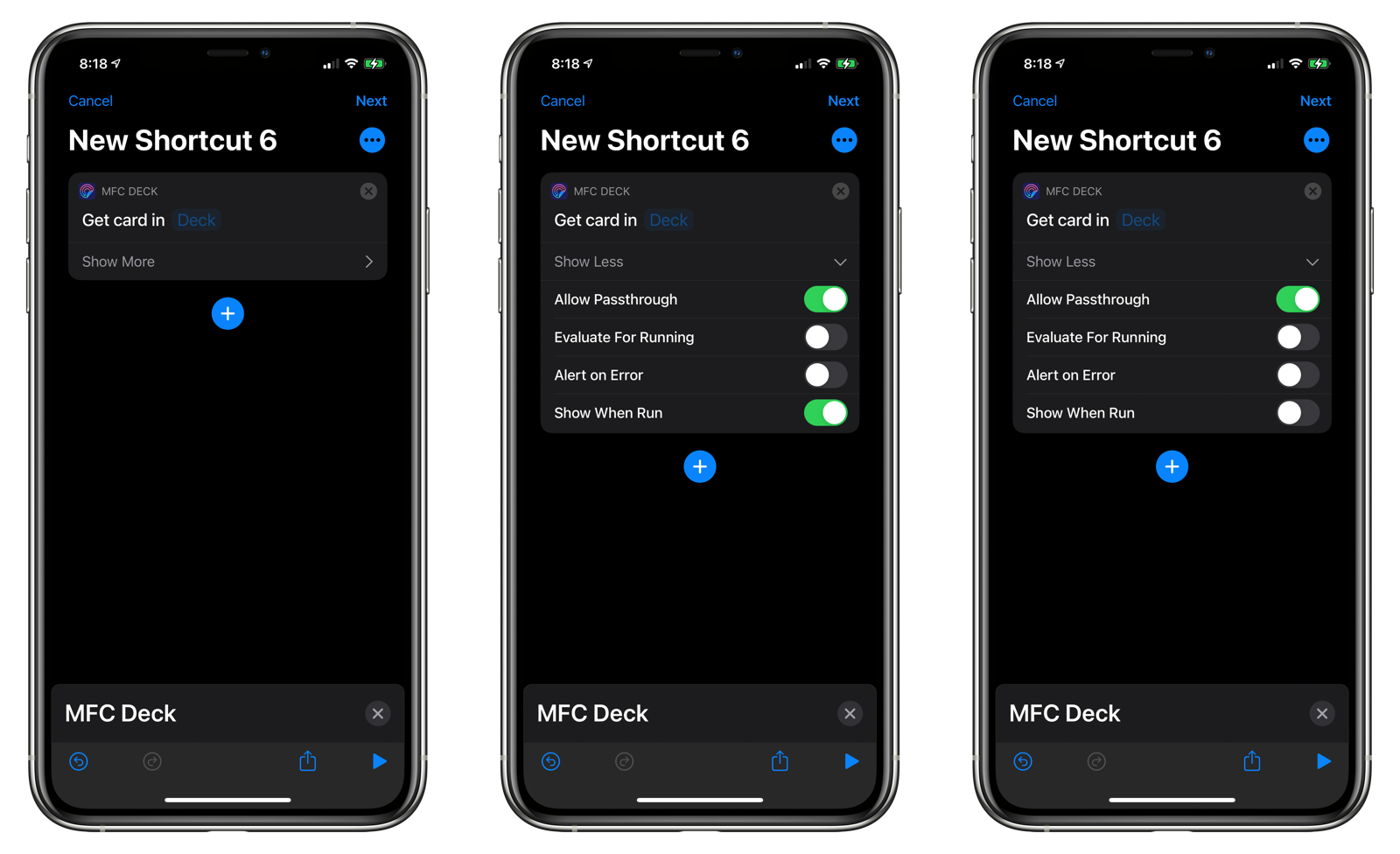
IMPORTANT: Disabling Show When Run Action
In many of the MFC Deck actions, a Show When Run toggle will be automatically enabled when you drag a new action in a shortcut. Tap Show More and disable Show When Run to prevent the Shortcuts app from displaying a sheet that you must dismiss before running the action.
Add Image
Adds an image to the MFC Deck Image Library. The name you provide to the action can be used in card results for displaying the image in your cards.
While MFC Deck automatically resizes the images to 512 x 512 pixels wide, it stores the full-resolution image on your iCloud account. Consider resizing the image before running the Add Image action to save additional space.
- Image: The image to add to the MFC Deck Image Library.
- Name: The name to give assign as a key to the image. Use this name in your card results to display the image.
- Replace Existing: If toggled, an image with the same name will be replaced by the new image.
There appears to be a bug with Siri and Shortcuts where it returns a cached image if you call Add Image repeatedly. While the image is replaced each time, the cached image may be presented in Siri or Shortcuts results. Workaround is to view the card in MFC Deck.
Background Automations
This action gets and sets various preferences for Background Automations.
Details on this action are located in the Background Automations documentation here.
Background Automations Details
This action returns a dictionary containing all of the settings from Background Automations.
Details on this action are located in the Background Automations documentation here.
Create Card
This action programmatically adds a card to a deck in MFC Deck.
- Deck Name: The deck to add the card to.
- Custom Title: An optional name for the card.
- Tag Name: The tag associated with the card. If blank, the tag will be automatically assigned.
- Action Type: The action to run when the card is tapped on.
- Save Result: If toggled, the return value of the shortcut or URL will replace the current result.
- Result: The preliminary result to display.
- Icon: The icon for the card.
- Color The color for the card.
- Allow Automatic Running: Enables the card to be run automatically via the Update Cards option in MFC Deck or via the MFC Deck Autocuts shortcut.
- Return to Home Screen After Widget Run: If this card is run from a widget, enabling this will cause MFC Deck to return to the iOS Home Screen when finished.
- Hidden: Hide the card from the deck, unless the deck has Show Hidden enabled.
- Replace Existing Card: If a card already exists in the deck, replace it. Otherwise, do nothing.
- Alert on Error: Display an alert if an error is encountered.
- Show When Run: This should always be disabled.
The MFC Deck Grid Creator shortcut uses this action to create an alphabetic grid of cards suitable for use with an NFC Deck.
Create Deck
This action programmatically creates a new deck in MFC Deck.
- Deck Name: The name of the new deck.
- Layout: The layout type for the deck.
- Parent: The parent for the deck.
- Create as Deck Separator: Toggle to display the deck as a separator.
- Quick Card Prefix: An optional string to place in front of the name of newly created tags and cards in the deck.
- Sort: Sort the cards by name, action, or manually.
- Enable Passthrough: If a request to run a card is made and the card cannot be found, allow the request to pass to the current and default decks. If a matching tag name is found in either of those two decks, the card will be run.
- Show Hidden Cards: Show cards that have the hidden toggle set.
- Show Tag Names: Display the card’s tag name in the card. This optional is currently unused.
- Icon: Set the icon for the deck.
- Color: Set the color for the deck.
- Columns: Set the number of columns to display in the deck.
- Favorite: Mark the deck as a favorite.
- Show Search Bar: Show the search bar when viewing the deck.
- Show Filter Bar: Show the filter bar when viewing the deck.
- Show Tab Bar: Setting to always hide or show the tab bar.
- Lock Screen Orientation: Setting to lock the screen orientation to portrait or landscape when viewing the deck.
- Sort Reverse: Reverse the order of the cards.
- Edit Mode: If enabled, tapping on a card will edit it. Double-tapping on a card will run it.
- Replace Existing Deck: If toggled, replace a deck with the same name. Otherwise, do nothing.
- Alert on Error: Display an alert if an error is encountered.
Create Tag
Creates a new tag in MFC Deck. Tags are assigned to cards in decks. A single tag may represent different cards spread across multiple decks.
- Tag Name: The name of the tag. This must be unique.
- NFC Tag: If toggled, this will mark the tag as an NFC Tag for identification purposes.
- Favorite: Mark the tag as a favorite.
Read the section on NFC Tags for more information on how to assign multiple actions to a single NFC tag.
Delete Card
Deletes a card from MFC Deck.
- Deck: The name of the deck
- Tag Name: The name of the tag associated with the card.
- Alert on Error: Display an alert if an error is encountered.
Delete Decks
Delete one or multiple decks from MFC Deck.
- Deck Names: The names of the decks to delete.
- Alert on Error: Display an alert if an error is encountered.
Delete Images
Delete one or multiple images from the MFC Deck Image Library
- Names: The names of the images to delete.
Delete Tags
Delete one or multiple tags from MFC Deck.
- Tag Names: The names of the tags to delete.
- Alert on Error: Display an alert if an error is encountered.
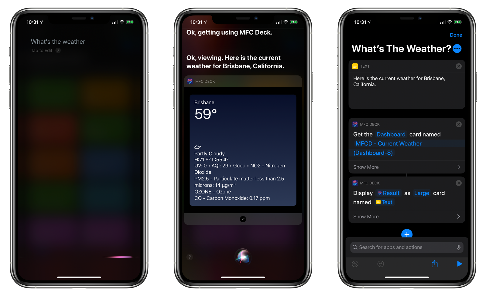
Display Card Result
Displays a properly formatted Card Result object. This can be used within Siri to display the response inline (i.e. no leaving Siri to open the Shortcuts app).
- MFC Deck Result: The result object. Can be plain text or a properly formatted Card Result JSON object.
- Size: Choose from displaying a small, medium, or large card. Or, display all the cards to see how the Card Result renders in different sizes.
- Alert on Error: Display an alert if an error is encountered.
Get Card
Retrieves information about a card.
- Deck: The name of the deck where the card resides. Can be left blank and the current or default decks will be searched.
- Tag Name: The name of the tag associated with the card.
- Allow Passthrough: If the card does not exist in the specified profile, look for a card with the same tag name in the current profile or the default profile to update.
- Evaluate For Running: Used by MFC Deck Helper to update when cards are run. Normally you will have this disabled when just retrieving information about a card.
- Alert on Error: Display an alert if an error is encountered.
Card Details
A Card Details object is returned, which contains the following information about a card:
- Available: A boolean whether the card is available to run or not.
- Notification: The notification level for the card.
- Action: The action of the card.
- Shortcut: If the action of the card is to run a shortcut, this field will be populated with the same of the shortcut to run.
- Run Type: Is the card set to Run and Return or Run.
- Input: The input to supply to the shortcut.
- Input Type: Interpret the input as text, a Data Jar variable name, a Toolbox Pro Universal Variable, or one of the three GizmoPack variable types.
- Result: The current result of the card.
- Save Result: Whether the card’s result can be updated.
- Switch to Deck: If the action of the card is to switch to a deck, this is the name of the deck to switch to.
- URL: If the action of the card is to open a URL, this is the URL to open, ping, or retrieve contents for.
- URL Action: What happens with the URL. Options include: Open URL, Open URL in Background, Ping the URL, or Get the Contents of the URL.
- Allow Running via Automatic Triggers: Allow the card to run via the MFC Deck Autocuts shortcut.
- Hidden: Whether the card is hidden or not.
- Deck: The name of the deck the card belongs to.
- Passthrough: Whether the card was retrieved through a passthrough request.
- Title: The name of the card.
- Run Count: How many times the card has been run.
- Card URL: A URL that you can use to run the card.
- Name: The name of the tag associated with the card.
Get Current Deck
Returns information about the current deck.
Deck Details Object
This object has many of the same fields used when creating a new deck.
- UUID
- Name
- Prefix
- Favorite
- Passthrough Cards
- Show Hidden Cards
- Show Tag Names
- Sort
- Color
- Icon
- Columns
- Landscape
- Show Search Bar
- Show Filter Bar
- Sort Reverse
- Search on Open
- Edit Mode
- Use as Deck Separator
- Cards: A list of names of cards in the deck.
Get Deck
Retrieves a deck.
- Name: The name of the deck.
- Alert on Error: Display an alert if an error is encountered.
Get Decks
Returns is a list of deck detail objects for all of the decks in MFC Deck.
Get Default Deck
Retrieves the deck details object for the default deck.
- Alert on Error: Display an alert if no deck has been set as the default.
-
Get Image
Retrieves an image from the MFC Image Library given its key.
Get Images
Returns the names of all images in the MFC Image Library.
Get MFC Deck Details
Gets various details about MFC Deck, including:
- Current Deck Name: The name of the current deck.
- Default Deck Name: The name of the default deck.
- Enable Triggers: Whether the trigger monitoring server is enabled.
- Version: The current version string for MFC Deck.
- Build Number: The current build number of MFC Deck.
- Evaluate Triggers When Running Cards: If enabled, all active triggers will be run whenever you run a card. For more details, refer to the section on the Triggers.
Get Tag
Retrieves information about a given tag.
- Name: The name for the tag
- Alert on Error: Display an alert if an error is encountered.
Tag Details Object
- Name
- Notes
- Favorite
- Cards: A list of cards associated with the tag.
Get Tags
Gets all tags in MFC Deck.
Get Triggers
Returns a list of all triggers in MFC Deck.
Trigger Details Object
- Type: The action of the trigger.
- Shortcut: If the action of the trigger is to run a shortcut, this field will be populated with the same of the shortcut to run.
- Input: The input to supply to the shortcut.
- Input Type: Interpret the input as text, a Data Jar variable name, a Toolbox Pro Universal Variable, or one of the three GizmoPack variable types.
- Result: The current result of the trigger.
- Save Result: Whether the trigger’s result can be updated.
- Switch to Deck: If the action of the trigger is to switch to a deck, this is the name of the deck to switch to.
- URL: If the action of the trigger is to open a URL, this is the URL to open, ping, or retrieve contents for.
- URL Action: What happens with the URL. Options include: Open URL, Open URL in Background, Ping the URL, or Get the Contents of the URL.
- Device: The device on which the trigger should run.
NOTE: Remember that triggers run only on the device where they were created.
Open Deck
Opens MFC Deck to the supplied deck.
- Deck Name: The name of the deck to open.
- Alert on Error: Display an alert if the deck could not be found.
Refresh Cards
Update MFC Deck’s card views when returning to the app.
Reload Widgets
Reload the timelines of all iOS 14 Home screen widgets powered by MFC Deck.
NOTE: This action does not do anything on iOS 13 devices.
Run Card
Runs a card’s action and returns to an optional URL of your choice.
- Deck: The name of the deck where the card is located.
- Tag Name: The name of the tag associated with the card.
- Open URL when finished: Toggle to open via x-callback-url an application after running the card’s action.
- URL: The URL to open. The default is the Shortcuts application.
- Allow Passthrough: Allow cards in the current and default profile to be run if the card could not be found in the specified deck.
- Alert on Error: Display an alert if an error is encountered.
Set Current Deck
Sets the current deck in MFC Deck.
- Deck Name: The name of the deck to set as the current deck.
- Open MFC Deck: If enabled, MFC Deck will be opened after running this action.
- Show Notification: Display a notification when the current deck is changed.
- Alert on Error: Display an alert if the deck could not be found.
Set Default Deck
Sets the default deck in MFC Deck.
- Alert on Error: Display an alert if the deck could not be found.
Start Monitoring
Opens MFC Deck and starts the Trigger Monitoring Server.
Stop Monitoring
Stops the trigger monitoring server.
Update Card Result
Updates the card result for the card given its tag name and deck.
- Result: The result to add.
- Deck: The name of the Deck where the card to update is located in.
- Card: The name of the card or the name of the tag linked to the card.
- Allow Passthrough: If the card does not exist in the specified profile, look for a card with the same tag name in the current profile or the default profile to update.
- Alert on Error: Display an alert if an error is encountered.
Update Shortcuts
An action for use only with MFC Deck Helper, this action syncs your Shortcuts library into MFC Deck.
Update Trigger Result
Updates the result for a trigger. The result is not displayed like a card result, but it can be used as a parameter to the shortcut assigned to the trigger.
- Result: The result to add.
- Trigger Name: The name of the trigger to update.
- Alert on Error: Display an alert if an error is encountered.
Card Result Format
The MFC Deck Card Result Format defines how your card is displayed in the MFC Deck app, voice responses in Siri, on Apple Watch, and in iOS 14 Home screen widgets. It is composed of a specially-formatted JSON dictionary. If you know how to write a HTML page, you already know how create a beautiful looking card for MFC Deck.
Refer to the example shortcuts to see how you can create simple or complicated Result objects for your cards.
Required Attributes
The JSON dictionary at its root must contain the following two fields:
{
	"mfcdeck": true,
	"version": 2
}
- mfcdeck: A Boolean value set to true. This instructs MFC Deck to process your JSON as an MFC Deck Result object.
- version: Set to 2 to support the current version of the MFC Deck Result Format.
If you do not supply these attributes at the root level of your JSON dictionary, MFC Deck will not continue to process the file and will simply store it in the result field of your card.
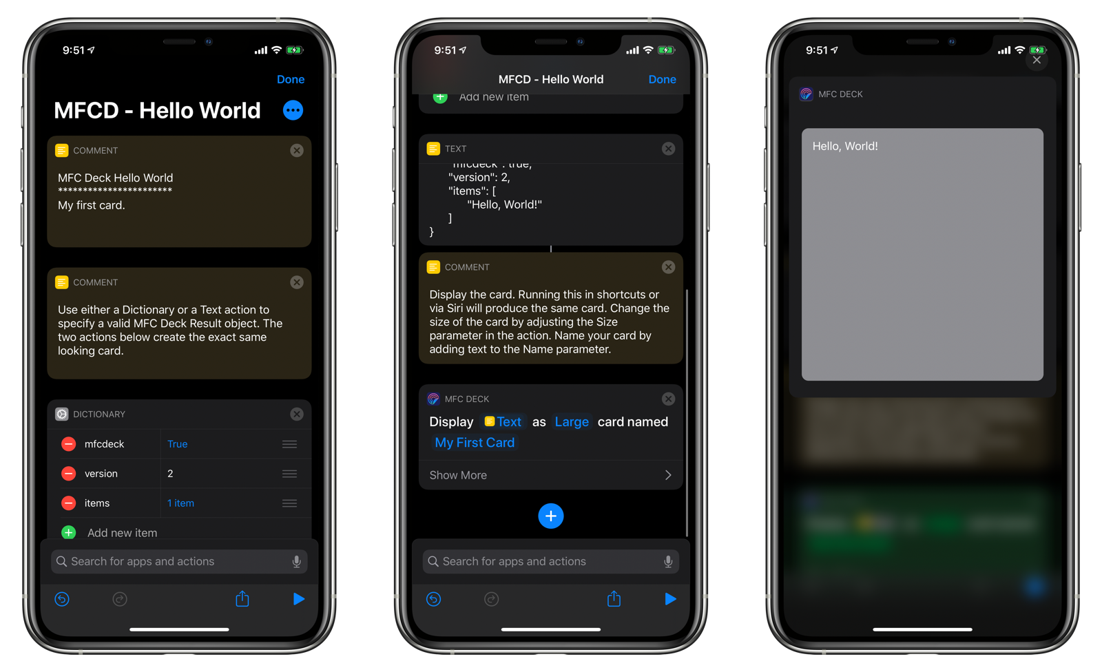
Hello, World!
Lets create your first MFC Deck Result object. Download the following shortcut or follow the instructions below.
- Open Shortcuts.
- Tap the + button to create a new shortcut.
- Add a Text action. Alternatively, you can use a Dictionary action and format it to follow what the code below looks like.
- Paste the following code.
{
	"mfcdeck": true,
	"version": 2,
	"items": [
		"Hello, World!"
	]
}
- Add the Display Card action from MFC Deck.
- Run your shortcut.
Result Format Fields
This section describes the fields you can specify in the MFC Deck Result object.
items
An array of items to display. Nested items are interpreted as alternating columns or rows of data to display in a card.
Root Level items
The items array located at the root level represents a stacked column of information. For those familiar with SwiftUI, this is a VStack. Consider the following example:
{
	"mfcdeck": true,
	"version": 2,
	"items": [
		"Hello, World!",
		"How are you doing today?",
		"What kind of card are you going to write?"
	]
}
The Result dictionary above will product a card that has the three text items stacked on top of each other.
Each item in the root items array is displayed on its own row.
If you specify a dictionary with its own items array, it’s contents will be interpreted as a row of information. For those familiar with SwiftUI, this is an HStack.
At the third level, a nested items array will be interpreted as a column of information. The fourth becomes a row. The fifth is another column and so on. Mastering how to organize nested items arrays is the key to creating beautiful-looking cards in MFC Deck.
Content String
A string as an item in an item’s array will be interpreted as a piece of text content to display.
Tokens
You can specify the following items to be replaced at display time.
Note: Not all tokens are available on all platforms.
- sfsymbol:SYMBOL_NAME: a string prefixed with
sfsymbol:, followed by the symbol name, will cause the corresponding SF Symbol to be displayed. - spacer: Inserts a spacer element following the previous item. Can be used to push items to the bottom of the card or to the trailing edge of a card. In SwiftUI terms, this represents a Spacer() object being inserted.
- [battery]: the current battery level on the device (i.e. iPhone, iPad, or Apple Watch)
- [batteryState]: the current charging state of the battery on the device.
- [brightness]: the current brightness level (iOS devices only).
- [clipboard]: The current text contents of the clipboard.
- [date]: the current date.
- [dateTime]: the current date and time.
- [deviceModel]: the model of the device.
- [deviceName]: the name of the device.
- [systemName]: the name of the operating system.
- [systemVersion]: the version string of the operating system.
- [time]: the current time.
- [volume]: the current volume level.
Dictionary
An item in the items start can either be a string or a dictionary object.
content: a string that will be displayed as image content.link: a URL that will be displayed as a tappable link in the app and in an iOS 14 Home widget (with restrictions).image: a URL to an image on the web or a string that is an image key to a file stored in MFC Deck. Use the Add Image custom action to add resized 1024x1024 PNG images to the app.width: For images, this specifies the bounding box width for the image. It is currently ignored by other dictionary elements.height: For images, this specifies the bounding box height for the image. It is currently ignored by other dictionary elements.spacing: Spacing for horizontal and vertical elements within the current row or column.font: The font to be used for the text. Default is the San Francisco font.fontSize: The numeric font size to display the text in.fontWeight: The font weight for text. Choose fromultraLight,thin,light,regular,medium, semibold,bold,heavy, orblack`.color: A hex color value.valign: vertical alignment of contents in the dictionary:topcenterbottom
halign: horizontal alignment of contents in the dictionary:leadingcentertrailing
textAlign: The multiLineTextAlignment value for text in the dictionary. Specify eitherleading,center, ortrailing.visibility: you can show or hide an object based on the card’s size class:hide-for-small-onlyhide-for-medium-onlyhide-for medium-uphide-for-large-onlyshow-for-small-onlyshow-for-medium-onlyshow-for medium-upshow-for-large-only
visibilityType: show or hide an object based on what is previewing the card. THIS FEATURE IS CURRENTLY NOT IMPLEMENTED.watch: Show or hide element on the Apple Watch.widget: Show or hide element in an iOS 14 Home screen widget.app: Show or hide when viewed in MFC Deck.intent: Show or hide element when viewed in a Siri voice response.
Root-Level Dictionary
The root level dictionary object of a MFC Deck Result has the following unique fields:
- backgroundColor: hex value of color
- backgroundGradients: comma-delimited, hex value of colors to be displayed from top to bottom in a gradient.
- margin: the amount of margin to use for the initial containing box. The default is 16.
URL Schemes
The following URL schemes are supported by MFC Deck:
open-deck
Opens a deck given its unique id:
mfcdeck://open-deck?id=142FC02F-8D8E-4A2B-8A3C-666E7F20337D
run-card
Runs a card given its unique id:
mfcdeck://run-card?id=142FC02F-8D8E-4A2B-8A3C-666E7F20337D
start-monitoring
Starts the trigger monitoring server.
mfcdeck://start-monitoring
stop-monitoring
Stops the trigger monitoring server.
mfcdeck://stop-monitoring
Exiting Shortcuts Properly
If users have the Return to MFC Deck preference enabled, MFC Deck will try to return to itself after running a shortcut. It does so by using x-callback-url. If your shortcut does not exit properly or if the user taps Cancel from a Choose From List or Choose From Menu action, the user will be thrown back to the iOS Home screen.
To prevent this from happening, it is recommended that you add a Quit, Exit, or Close option at the bottom of your menus. Attach an Exit Shortcut action to this menu item. Tapping this menu option will exit your shortcut properly and return the user back to MFC Deck.
Remember that the return value to your shortcut may be interpreted as an MFC Deck Card Result, so be aware of what you are returning when exiting your shortcut.
NOTE: If you do not want MFC Deck to open after running, instruct your users to add your shortcut to the list of excluded shortcuts in MFC Deck’ Settings.